A short story about a change

Beginnings:
It has been over five years since Vstorm came into being.
As we are technology-driven, launching our brand as a Minimum Viable Product was our number one priority. It was less about the visuals and more about the development and operations.
With time, our fast-paced growth has pushed us into a new era. We wanted our branding to reflect our evolution as a global digital community. Aligned concepts have arrived, and now we are fully committed to fresh ideas. Let’s have a look at the story behind it.
Time is now
“Our vision is to become a global community that leverages a digital transformation potential and design human dream lives from any corner of the planet, at any time.“
Antoni Kozelski, CEO & Founder
In other words, we believe that work is no longer confined to the desk, thanks to digital transformation. Once you shift the optics and put individuals in the center, all puzzle elements start to fit together. Work culture has to revolve around its people and consider their specific needs; otherwise, it is inhuman. So, in short, our goal is to tailor our culture to fit the needs of digital nomads and familists: financial, mental, and physical well-being.
A partnership that makes a difference
Our community specializes in high-tech applications and remote team development — our projects impact hundreds of thousands of people and solve technological challenges. We’re focused on helping companies grow their businesses in the digital age and aid them in doing it correctly with the right people. To reflect it, we have needed a coherent rebranding to show how exactly we unblock our partners’ full digital and business potential and how we can evolve together with the community.
Driving potential
To maximize the potential of our community members, we have included development opportunities, community clubs, an advanced budget, and a platform such as Motivo. It is Vstrom’s way of designing their lives exactly how they want to live them.
Being community-driven means, we strive to strengthen connections, build capacity, and take action on behalf of the community. As well as to overcome challenges and celebrate successes!
Thus, the logo, colors, typography, and, most importantly, a clear, consistent, and precise message had to reflect these substantial changes in our approach.
Our workflow
We prepared a complete, detailed strategy of what we want to achieve by this rebranding. Then came an in-depth look at workplace 4.0, a concept, and how to put it into action. But, the most important thing was that we talked among ourselves, did benchmark research, and even imagined how we wanted to brand our digital nomad devices.
Give the community a voice
Among many options, we opted for one and followed the practice we have in Vstorm: to provide a community voice. Through a series of brief phone calls, we contacted all community members and partners to hear their opinions and associations about the new logo proposal.
Color palette
And we worked even more. The first feedback was very variable. Some of us were sad to see the yellow go. So we dedicated ourselves to color study. Smart black, Infinite white, Whisper grey, and our queen – Coral red, was a color palette that stole our hearts. Dynamic, yet emotional; decided, yet human-centric – precisely the way we want our community to exist in the world.

And there she is
Simple, dynamic, beauty of energy in the air.

The idea behind the logo
The starting point was the core of our community – the individual. This idea evolved to show the power and energy of acting together so that all community members can add value to each other, support each other, and develop their skills. “We wanted to convey a clear, precise message that had an impact. And we wanted to show our action-loving nature as well,” adds Jagoda Malanin, a marketing specialist.

That’s not all
Of course, the logo is only one part. Typography and color palette add to our cohesive look & feel. Then, you have a set of assets that build the whole branding and the strategy. Finally, we’ve created a new visual identification and website with endless possibilities that we have implemented in our work!
Workplace of future – Motivo
Along with visual identification and enhancing our communication channels, we are now focusing on the core of workplace 4.0 – we have launched Motivo. This application helps the growth and personal development of community members. At this point, it is a platform that enables the optimization of HR processes through gamification and personalization. Motivo will soon be available as a stand-alone PaaS product. The platform will help companies transform to workplace 4.0, boost employee motivation, and digitalize HR processes.
Feel welcome
So we now invite you to join the Vstorm community, a community that, as we believe, will drive your full potential. We’ll keep you posted via LinkedIn, our social media channels, and online Vstormers Talks which are yet to come.
& stay tuned
👉🏽www.linkedin.com/company/vstormco/
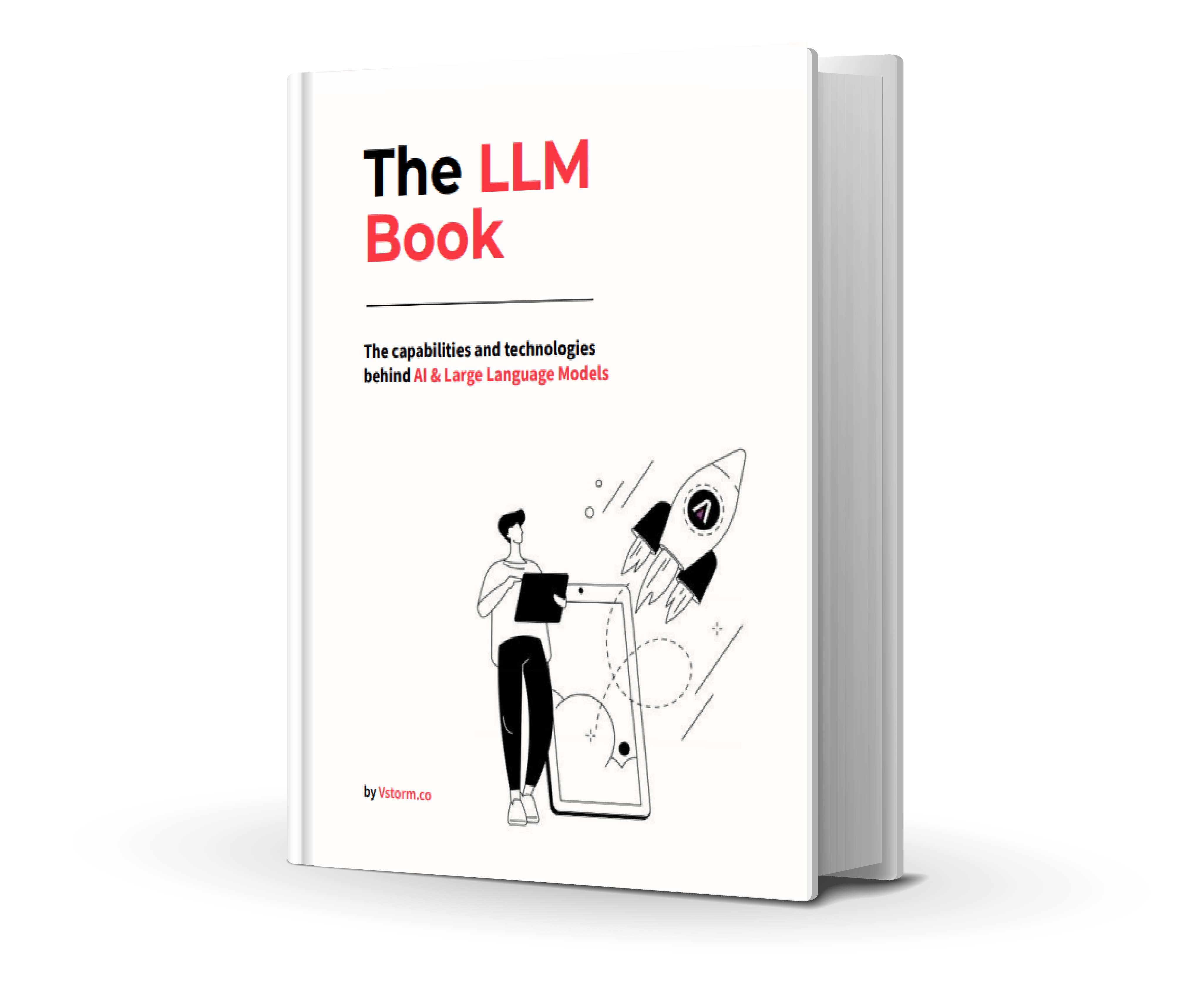
The LLM Book
The LLM Book explores the world of Artificial Intelligence and Large Language Models, examining their capabilities, technology, and adaptation.